What’s a CompleteSet?
The Completeset app and company (as it stood at the stage when this app was completed) is an encyclopedia for collectors. In it, users can archive things they collect, things they want, and keep track of both, while socially networking with other users who share similar interests, and learning details about items they wish to collect in the future.
Why did we make it?
At CompleteSet I was responsible for the UX and UI development of their Android app, and this is the subsequent result of the project. The application (shown here in it's first full release form) was designed for usability from the beginning, and to seamlessly meld into the Android ecosystem as well as any native Google app would. As a result, it was designed with strict adherence to Android Material Design guidelines and recommendations, deviating sufficiently from both the CompleteSet website and iOS app without divorcing itself from the source applications look, feel, and usability.
How I started
Leadership directives called for me to move directly to high fidelity wireframing as the first stage due to limited time and budget constraints. Despite pressure to move quickly, I was able to move forward with low fidelity wireframing in the form of sketches as a first step to validate the base functionality and sitemap before taking further steps in high fidelity.
New User Flow
The initial sign-up pages involve a quick and easy new user experience walkthrough enabling users to get themselves set up following companies or themes they may like, as well as items they either own, or wish to own in the future. By selecting themes they like, such as star wars, the next page auto-fills with items falling under the aforementioned themes which they can then mark as "have" (check mark) or "want" (heart icon), as well as follow collectors in their contacts list who may be using the app, or share similar interests.
Home Page
The home page lists recently added collectibles pertaining to the users interests, and includes a drawer that slides out, per the Material Design guidelines containing collections of items the user has compiled (which they create both in the NUX and later on) as well as links the settings and user profile. A collapsible Fab expands in the lower right hand corner to support uploading items that may be missing from the archives, sharing items with other users, and to list items for sale (an upcoming feature at the time of this design).
Search Results & Item View
An auto-fill list of search results would autocomplete as the user types. Both archives, items and users, appear as possible results, sorted under respective headers for clarity.
Also depicted is an item page, as would be found in any archive--in this case a Star Wars Wicket doll. Note the pills for archive linking, item detail, and use of Material Design spacing in the lists
User Profile &
Archive/Collection
The app accommodated listings by individual user profile as well as by archives and collections. Archives and collections contain all related items that one can collect within that theme/genre. User profiles contain the same thing, but listed relative to what the user has collected or wishes to collect. As a result, the decision was made, for the sake of consistency, to user the same basic layout for both user profiles and archives (think of an archive as being a company's "user" profile).
Filtering
A filtering function was added to both user profiles as well as archives enabling filtering by user "wants" and by user "haves". A date slider pertaining to the timeline of manufacture of all items subject to the blog, as well as category, was included to greatly refine browsing and searching, especially when a user may not remember the exact tags or names of an item they are seeking.
Notifications & Options
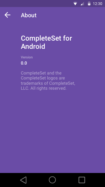
Notifications are listed under the bell icon, and appear in bold until tapped on. Notifications often involve social media updates. Here the user can also open their followers from both the options hamburger on the right hand upper corner or by tapping the name of a notification indicating a follower from the context of the users profile. They are given the option to follow people back who are following them. Subsequently, the final two screens show the preferences screens the user can access from various parts of the app, including the drawer on the left and the upper right hand corner hamburger, as well as information regarding the app.
What happened
When the app launched a few months after being completed, it was met with very positive feedback in the form of Google Play Store reviews, with various mentions calling out the easy and intuitive user interface as a highlight of the app.
Date: 2015
Service:UX/UI Design


