Ebay Reimagined
This project was envisioned as a way to modernize the Ebay mobile app in 2018. The patterns being utilized at the time were dated and following an older Material Design pattern.
Research Stage
The eBay e-commerce platform is a very successful platform, but suffers from some age and limitations. I took it upon myself to identify these issues and correct them. Below you can see where the UX research led me. The entire app is funneled through a specific, singular drawer which results in a both convoluted and tedious step every time a user wishes to navigate anywhere in the app.
Site Mapping
Personas
The personas that guided the navigation UX redesign are John and Jessica. John is an active ebay seller, while Jessica is a passive buyer and cross shopper. Their usability needs directed the solution to encompass a more structured and compartamentalized navigation that allowed faster movement between app components and functions.
Exploratory Wireframing
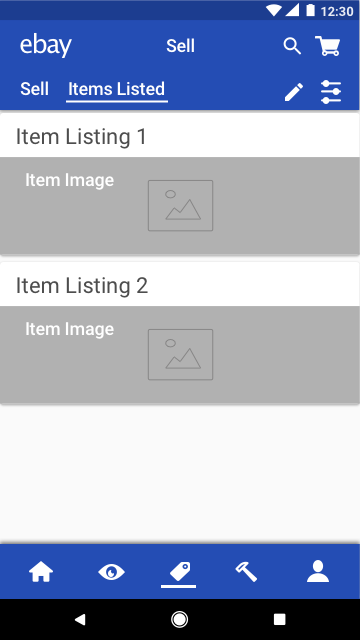
I created several sketched wireframes from the ideation process, leading me to the preliminary designs seen below, which later evolved into the final digital wireframes. By creating a footer navigation bar with various components of the drawer inserted in each, the user is offered quick navigation between each major app function, while simultaneously improving the grouping and intuitive layout of app features, such as watched items and bids.
Research Results
By reviewing competitive apps and forming user personas, I was able to assess the effective contemporary standards and visualize a UX solution that maintained full functionality of the app while adding a significant level of structure and ease of use to the navigation structure, visualized through the following navigation flow. The design is structured through a top down, forward facing navigation with optimization for movement between portions of the app that are commonly accessed.
Final Wireframes
The ability to move between sections of the application such as the user profile and the watched items is fluid and straightforward, and encourages effective shopping and staying power of the app with the user.
The final medium fidelity wireframes are derived from the early sketches shown above. They are meant to both impart an understanding for the revised layout, account for all functionality, and provide a feel for how the high fidelity design may feel. The wireframes start with the assumption the user will be taken to the home screen on login.
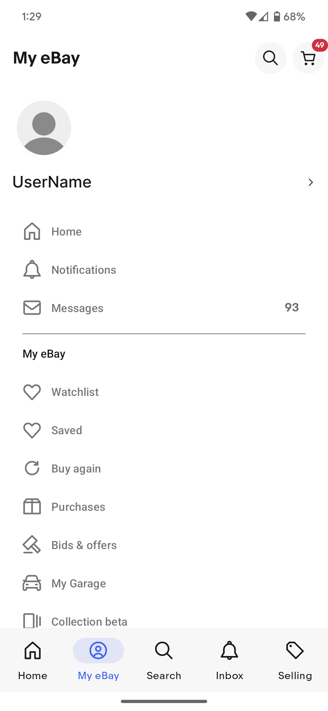
eBay Today
Recent updates to the eBay site are closely aligned with the features I imagined
Date: 2018
Service:UX/UI Redesign


